3D I – Retopo and Photogrammetry

This week we got to try something a little different, namely to attempt a retopo of our own faces. This was done by first taking a bunch of pictures of our faces from different angles with reference marks drawn on our cheeks and foreheads, and then letting the software 123D catch interpret these and assemble into a 3D mesh, complete with photo textures. It does this be recognizing points that are shared between several photos and from that creating a projection of a 3D model.

Unfortunately this didn’t quite work for me, since the software wildly disregarded the reference points, and even with lots of manual encouragement wouldn’t assemble much more than one very badly deformed temple and cheek. So unfortunately I didn’t really get to do a retopo of my own face, but rather of a random person from an example file…

It was still rather interesting though, both to create a retopo of an existing face, and to see what you can actually do by combining a series of pictures through software. Unfortunately the trial-period of 3D Coat expired before I started on this blog, so I didn’t really manage to take very good screenshots of what I managed, below is the only one I got…
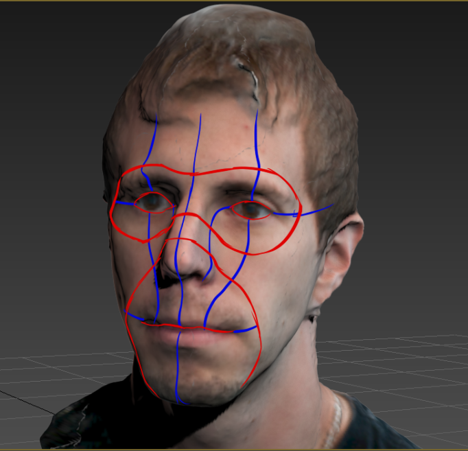
However I did also include a picture of the model from 3DS Max, complete with basic edgeflow drawn on top, depicting the major areas to take into consideration when modeling faces, around the mouth and eyes, as well as the major face-loops that you should try to go for.

Retopo in 3D Coat.

Retopo in 3D Coat

Main edgeflow of the face.

Main edgeflow of the face.

Also this week we were asked to look at the article “Photogrammetry in The Vanishing of Ethan Carter” and give our opinions on the subject. Basically photogrammetry is the process described above when creating a 3D mesh and textures from photographing an object from many different angles and letting software project them all together.

In short the process is very impressive indeed, and making a retopo of an existing high-poly model seems to be a lot easier and less time consuming than creating it from scratch. Also, assuming that you are going for a realistic look, ought to be able to mimic reality to a closer degree.
Something that I was a little bit worried about though was that it might be used to mimic reality too closely, which in some cases may very well be exactly what you want, but to me that would most likely become quite dull quite fast. I always found games that differed from photorealism to be a lot more intriguing visually. Ultimately they did dispel my worries though as the article stated that the photogrammetry was used in the production to create a base that felt “real” to build the rest from to the desired aesthetic.

Also worth noting is that although the technique undoubtedly shows a lot of promise, it isn’t perfect yet. A lot of factors had to be taken into consideration when taking the photos, such as lighting, contrast, and even extremely minute shaking when taking pictures, that would often make the process very complicated and time consuming. That is probably why the attempt at my face yielded such poor results…

3D I – Assignment III – Update

Here’s a quick little update on the progress of Assignment III, modelling a character.

This week I got as far as creating the basic shape of the torso, arms and legs using a couple of planes with the turnaround attached for reference. There really isn’t too much when it comes to detail yet, but the basic structure comes first.
And as far as I gathered the basic structure should be fairly complete after next week’s lessons.

A basic edgeflow plan.

A basic edgeflow plan.

The model of Sam so far.

The model of Sam so far.

And that is basically that.

3D I – Evaluation of Anatomy

We were asked this week to evaluate our, and some of our classmates, knowledge of anatomy, and to reflect on what aspects of this would need improvement.

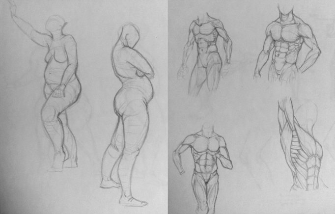
Here are a few drawings from my sketchbook, sorry for the poor quality, but cellphone… It’s mainly life drawings with a couple of muscle studies on the last one.

1

2

I do feel that I have a fair grasp on the major workings of the main body, both when it comes to proportions and musculature. Of course there are still a myriad of motions, muscle relationships etc. that are still a bit above me.
Not to mention hands, feet and faces. These I often avoid drawing to some extent, since they really tend to come out a bit odd. But this is of course a very obvious sign that they are what need most work.

The feedback that I got from my classmates was that my grasp of anatomy appeared rather good, but the lack of hands, feet and faces was rather obvious. I have been focusing quite a bit on the main body, as I said before.
And therefore it was suggested that I try to focus more on these parts. The tricky parts. And of course I have to agree, I already know that this is where I lack knowledge and skill, and they very much confirmed this for me.

For the most part I think that the knowledge of anatomy that I lack could be fixed by simply drawing the relevant areas more and studying them more in detail. And when it comes to overall action and body-dynamics it would most likely be of great value to look at other artists, how they manage to create movement and interaction in an effective manner.

Then we were supposed to come up with a plan to attempt improving our knowledge of anatomy over 6 months, with 2 month goals. A very sound thing I must say, and hopefully there will be enough time for me to follow it.

First of all I would like to make anatomy studies to really understand the parts that I need to improve on. This would mean studies of the structure of hands, feet and different faces, applying the theories/techniques that we learned in 2D last year and figuring out what works and how/why.
Ideally I would attempt a few portraits of faces with different character and angle as well, and the same for hands performing different actions. At the moment feet doesn’t seem quite as relevant, so I would rather focus on the other two for now.

Then, of course, I would like to do more life drawing. This helps very much with proportions, gesture lines and general feel of the body’s movement. Unfortunately the life drawing classes that I intended to attend were cancelled, but hopefully there will be another one in the spring. Otherwise I will have to draw from pictures, from pixelovely or such.

At the current level of schoolwork I can’t really imagining being able to spend as much time on improving this as I would have liked though, so I am going to be a bit careful saying that I may be able to spend half an hour to an hour each day on this.

For the first two month goal I would say that I would like to improve on faces primarily.
What I would like is a fair grasp of how faces are constructed, and how to draw them from different angles. Rotating faces and maintaining proportions has always been a big pain.

For the second two month goal I would instead shift over to hands predominantly. This I would do in a more technical manner, studying the construction slightly more in depth than for the face, looking a lot on the bones, tendons and musculature. This since the movement in the hand is quite vital when performing tasks.

And for the final two month goal I would like to have worked more on the overall body, again looking into the anatomy of the main body and how movement affects it.
This part should however not be neglected even during the other months as well. It is quite vital to know movement and dynamics if you want to draw something interesting.

3D I – Assignment II – Update

Here’s a little update on the progress of Assignment II. I think I have missed one of these, but I hope that’s okay anyway.

The model as seen in UDK.

The model as seen in UDK.

As you can see I have managed to get the model finished and applied a diffuse, a specular and a normal map to it.

Although there are a few things that I still want to fix on the diffuse, and subsequent specular and normal maps, I am starting to feel that it is getting fairly final.
There is still an issue with the lighting on the diffuse, that I honestly don’t think I’ll be able to fix entirely. I’ve been spending ages on trying to remove the cast shadows on the reliefs and balancing the values across it, but there are still rather obvious traces there.
Silly museums and their poor lighting.

The diffuse, specular and normal maps.

The diffuse, specular and normal maps.

Even though the model is supposed to be final at this point I am also considering altering a couple of minor things with the broken surfaces on the pedestal.
This would be by cutting in extra edges/faces just to make the surface less regular.
This wouldn’t necessarily alter the UVs much though, as any resulting distortion would be very minor.

And I’m not entirely happy about the resolution of the textures on the final model. Even though I use 2048p maps for the entire object it still gets rather… grainy. I doubt I could fix this by rearranging the UVs for better resolution on each face, even though I realized after starting on the diffuse map that I could probably have optimized it just a little bit more.

And maybe I have to take a closer look at the lighting in UDK. It’s so bright it makes details vanish.

And that is pretty much that I think.

Oh right, when it comes to seams I will definitely try to use something like Mudbox or zBrush to get a good result, fixing them in Photoshop is a genuine pain…

3D I – Assignment III – My Characters World

The world at large is rather mundane but quite picturesque. Neighbors greet one another with smiles, children play, flowers and trees grow in nooks and crannies making a very cozy landscape, recycling has never been more effective and electric cars are on the rise!
Within this world the game takes place near the metropolis of Niceville, a city with tall buildings, where cats and dogs don’t fight more than they really have to, street musicians play tunes that don’t get annoying and police officers greet you with a hearty “Top of the morning!”.
It’s a bit like Chicago really, but just a little nicer.
(Disclaimer: I’ve never been to Chicago, so if it instead happens to be a crappy place then Niceville is considerably nicer.)

The game takes place in a time very similar to our own, the beginning of the 21st century. The technology that is available is pretty much the same, just that the distribution is slightly different. For instance electric cars are on the rise, and mostly motor-enthusiasts stick to combustion engines.
On the other hand slim televisions and very clever cellphones aren’t quite as common as they are for us, they are usually something reserved for the younger. The pensioners (that the story will focus around a bit) will instead have a love for the old boxy SD TVs, radios with catchy tunes and cellphones that can’t do much more than calling and texting.

The suburbs are generally filled with the elderly and families with children. Niceville however is where people venture to find their careers, adventure and fortune! But generally in a nice, non-cut-throat way.
Overall the population is evenly distributed between men and women, and quite even across ages as well. Due to the theme of the game there will however be 3 main age groups, that is children (ages 7-12), adults (parents) and pensioners. Teenagers may very well make an appearance, but are not integral to the world or story.
Also worth mentioning is that pets are a very common thing, so it is by no means uncommon to see cats and dogs running around or laying lazily in the sun.

As the society at large is based on western civilization and culture, primarily the US, most of it should be rather commonplace for us. The society uses democracy to determine its local government and elects a president that resides somewhere far off and does… stuff. His function isn’t really relevant on a local scale, other than as a figure to whine at when things aren’t exactly as you want them to be. That’s really the function of all the politicians for many, and the occupation have therefore become one that most people dislike a great deal.

The society, like any, has a division between the rich and less rich (There are no real “poor” people in this world though. At least not in Niceville), but this seldom becomes an issue since no one wants for what they need regardless.
Religion, or belief, in the society is a little bit more similar to the way it is in Sweden rather than the US. There are or course people that are believers, mostly among the elderly, but even those aren’t necessarily hardcore believers. There is a relaxed attitude when it comes to sermons and mass, and most believers have a “personal” relationship with their deity rather than one enforced by attendance on Sundays. Mostly. There is the occasional old man/woman that speaks of impending doom and brimstone as well.

The society has been peaceful for many decades, and so the military has become rather lax and more of a figurehead institution rather than one of genuine military might.
Which would make them a little bit useless in the case of, I don’t know, say an alien invasion?

3D I – Assignment III – Character Description

So for Assignment III we are supposed to model one of the other students’ character concepts, and the one I received was the character Sam from Jonna (http://moonphanter.wordpress.com/).

Some of the instructions that I got for the task was that Sam would be able to open his mouth and perhaps try and make the pants a bit more asymmetrical and worn.
Otherwise the turnaround and action pose showed the character rather well, so I think there shouldn’t be much of a problem.
She had even included separate sketches for details like the hands and mouth. Together with this was also a good character sheet describing Sam and the world.

Character Background Sheet:
The character’s name is Sam, and he is a young adult male of a humanoid cat race.

Sam is usually happy, curious and inquisitive, though a slow learner.
He is rather emotional and can have a short fuse which makes him easily aggravated. This usually just makes him a bit foul-mothed, but not violent. He avoids real fights, but if forced he can become very aggressive, which he dislikes about himself.

Despite not being the very brightest, and a bit of a slow learner, he is still curious and determined to learn. He still often relies more on instincts rather than his intellect though.

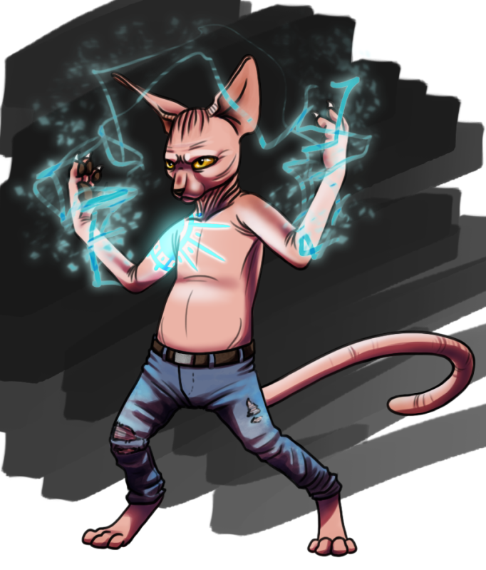
Action pose of Sam - by Jonna

Action pose of Sam – by Jonna

Sam is a bit shorter than average. He’s got large eyes and ears, pads on his hands and fingers and retractable claws, like you might expect from a humanoid cat. Similarly he walks upright on two legs.
Except for his whiskers he is entirely hairless, and rather wrinkly. This means that he is more exposed to weather and sun. Because of this he always wear some kind of clothes, preferably rather worn denim. Another notable attribute is the tattoo on his right shoulder that aids with his mastery of magic.
Although being slow and wiry, he has very good balance.
He cares about his hygiene. This doesn’t mean he minds getting dirty, just that he likes to keep clean.

One of the more special things about Sam is that he is able to control magic, although he is afraid of it. This in turn inhibits his mastery, except when he becomes aggravated.
Magic is created through various chants, signs and movements.
His tattoo, a courtesy of his old master, also helps with the mastery of magic. It makes Sam feel a lot safer, since he worries about his magic hurting others.

Sam comes from a shattered family and was forced to move around a lot between relatives with his sister while growing up. They accepted her more since she had fur though. And finally as he discovered his magic potential he was cast out, as the family feared even greater misery.
This is when he was found by his master Mundu, another mage. Sam consequently became part of his apprentices.
Mundu later died under uncertain circumstances. Liana, an acquaintance, took over in his stead. Sam never trusted her though, so Sam and his friend Melinda started searching for the truth.

The game’s world is rather similar to ours as it is relatively modern, but inhabited by humanoid cats. Many of these wear clothes in a similar manner to us, but this is still rather optional since most of them have fur, which both protects and is considered something beautiful.
In this world exists a power called the Great Spirit. This can be described as the essence of life, and is closely linked to the workings of magic.
Only certain people can use magic though, and these are generally feared. The practice is even seen by some as a violation against the Great Spirit, but by others as a gift from it instead.
Regardless it is often feared or even forbidden since it can cause great harm.

The Visual Style is supposed to be cartoonish and a bit similar to the Competitor Games below. These games use heavy textures rather sparingly on characters and tend to go more for clear, bright coloration where shading defines form. Texture is then added as a supplement to this.

Competitor Games:
Dark Chronicles (A lovely surprise to see on the list. Although old that game is awesome!)
Kingdom Hearts
Jak and Daxter

Personal notes:
I’m pretty determined to try and alter the concept as little as possible during this assignment, although I may inquire about details later.
One thing that occurred to me was that the tail is in a bit of an odd spot. There is an explanation for why that is, but I’m still a bit afraid that it will look awkward in motion.
The ears I wondered how to make as well, if they could be a bent plane with a triangular or rectangular cross-section at the ends to give it some form beyond a thin plane.

There are some things that I will have to look into when it comes to the software for this character.
First off I will have to start out by learning how to Mirror, to make it a bit faster and easier to model the character.
And then I have to learn how to apply a mask for an alfa-channel, since this will be used for the teeth, and perhaps even for some details on the pants.
I could even try to do this with the thin ears, but I really think that would look a bit shoddy.
And speaking of the ears, I have to look into if a plane can have different textures on both sides or if this would cause a problem with clipping textures or something.

One risk I see immediately is that I tend to use rather limited amounts of geometry when I model. I am a little bit too much for optimization and may therefore make a model that is a bit “blockier” than it has to be. So I really have to make an effort not to skimp on the polygons on this one. At least to start with.

3D I – Assignment 1 – Final

And here it is! I present to you, the pinnacle of Assignment I, the Contemporary Urban Crate!
And with it comes a little discussion, of sorts, about the types of maps used and their purpose.

Final version of the crate, with 512p maps.

Final version of the crate, with 512p maps.

Diffuse Maps
First off, the Diffuse Maps. This is probably what most think about when they hear “texture”. The diffuse map is pretty much all the basic color information for the object. In this crate it is for example the color information for the wood, showing its grain, branch-marks, separation of planks and the nails.

The things that are good to keep in mind when creating the diffuse map is first of all the layout of the unwrapped UVs. If you don’t keep that in mind the grain (if using this crate as an example) could very well go in different directions on different boards and so on.

Then you need to keep in mind to be very careful with shading on the normal map. When applying light in an engine it would probably look all kinds of wrong with cast shadows from the light source, and separate painted directly on the diffuse map (that are obviously not guaranteed to follow the light in any way). So on diffuse maps the only shading should be self-shading, like a subtle shading in corners or folds, or on occasion shading to accentuate forms.

Also, will the diffuse map have to tile? That could potentially be a big one if you are creating a wall or similar.

Specular Maps
The basic function of a specular map is to determine how shiny an object is, and therefore help one see what kind of material it is made of. This can be very important to help determine what the player Is actually looking at. It determines for example that metal reflects light more than cloth and so on.

On this crate the specular map is actually fairly strong, since aged wood can reflect quite a bit of light from certain angles. The rusty nails were made slightly brighter than the rest as, a bit to my surprise, even rusty nails tend to have a slight metal shine.

The process of creating a specular map is usually a rather simple one. You start by desaturating a copy of the diffuse map, and then simply alter the brightness and contrast of the different parts to relate to the different materials. Anything that is supposed to be shiny should be closer to white, and matte closer to black When creating a specular map for the aged wood this meant that the brighter, smoother surfaces became the shinier ones, just like it should be.

And that is pretty much that.

Normal Maps
The normal map is a very nifty little thing that helps create the illusion of unevenness and depth on a surface. It can give the illusion of indentations and extrusions from the base-model, even though these are simply an illusion created on the materials surface. On this crate this becomes most apparent on a side when it is about to be covered in shade and some parts of the flat surface still manage to catch a bit of light.

A basic rule for when to apply normal maps is to make the model for the silhouette of the object, and anything that then should have depth or extrude, but not break this silhouette, should be created using normal maps.

There are two basic ways to create a normal map (as far as I know at least). The first is to take a copy of the diffuse map, desaturate it, and then alter its values. It is a bit similar to creating a specular map, but instead of being shiny, anything towards the white spectrum will give the illusion to extrude from the rest, and anything reaching for black will become an indentation instead.

The other method is to simply “bake” one from a high-poly model of the object.
Something about the normal maps that can be important to keep in mind is that they are composed of three different layers of information, via the three RGB-channels. Should the normal map come out wrong, it’s therefore usually just best to make another attempt at it rather than to attempt fixing the normal map.

Should one despite this want to fix the normal map it would likely be best to try and fix each channel separately, as to alter the combined picture may create undesired results.

The final Diffuse Map, Specular Map and Normal Map.

The final Diffuse Map, Specular Map and Normal Map.

3D I – Textured Crate

This week we were supposed to take one of the themed crates we created a couple of weeks ago and apply diffuse maps on it.

When I created the model I was going for the Contemporary Urban theme, so after a bit of pondering I decided on making something along the lines of a fruit- or farmers crate, focusing more on the basic function of the crate rather than something lavish.

The crate with an applied UV-Checker.

The crate with an applied UV-Checker.

As for the coloration I went with, I had intentionally intended to go for “healthier” yellow/orange colored wood so that the crate could still appear quite useable, but I happened to stumble across a nice texture of greyish aged wood instead. So instead I decided to go for an older crate that’s seen the best of its years.
Or to be perfectly honest, what I really wanted was a mahogany fruit crate, something for the very fanciest of fruit-traders! But once I found the more traditional aged wood I decided to go with that.

The final diffuse map.

The diffuse map.

So grey quite naturally became the main color of the entire crate, with minor additions of rusty red for the nails. Overall the choice of color itself isn’t something that will make people look at it in awe, but I do think that the texturing itself, for a first try, is pretty decent.
At least I found myself looking at it, perhaps a bit more than I should, thinking to myself that it didn’t look very bad at all.

Crate with applied diffuse map - as seen in UDK!

Crate with applied diffuse map – as seen in UDK!

There was no particular reason to why I chose the main color grey concerning special significance, other than the fairly obvious connotations of wear, tear, age and decay.
After a quick look at suggestions of the color grey’s meaning, it was stated that grey was the color of least emotional significance, only really conveying a slight dampening of the mood and in extreme cases depression.
I suppose this would work quite well with a discarded, degrading crate. It could most likely have been accentuated a bit more though had I modeled the crate as being damaged.

Although the texture of aged wood I found was virtually entirely grey, it wasn’t entirely desaturated. It still maintains some of the woods original yellow/orange, though barely enough that you would notice.
This became quite apparent as I had to find a cross section of a tree to finish the edges of the boards. This cross section was originally a very vibrant yellow, but had to be desaturated and lightened to fit the rest of the wood. It could however not be entirely desaturated since that made it loose the very last of its vibrance, making it very dull indeed.

I did actually think about adding a bit of lichens to the model as well, perhaps ones in a rather nice yellow tone, but I wasn’t entirely sure how to add another layer of textures for this. I could have added it directly to the diffuse map, but odds are that it would have been very easily noticeable that the lichens repeated, other than on the bottom boards.

3D I – Object for Assignment II

When visiting the museum the object that I decided to go with was a not entirely complete baptismal font from the 12th century. It was crafted by stonemasons working in what was called Byzantios craft, which was a particular style that the local craftsmen used (quite evidently a reference to the Byzanthine Empire, which appears to have been a main influence even though the style originated in northern Europe), and appears to have been a part of Linde church.

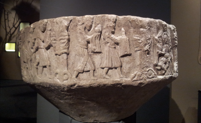
Part of the font's relief. Could hopefully be cleaned up and work as a diffuse map.

Part of the font’s relief. Could hopefully be cleaned up and work as a diffuse map.

The main reason that I chose the baptismal font was simply that it appealed to me. I am a bit of a sucker for ruins and worn carved stone, so this immediately struck a chord in me.
Also while looking at it, it was rather clear that it probably wouldn’t be all too difficult to model, allowing me to focus more on the textures. And despite being a stone baptismal font, there were some rather nice textures on it. Foremost of course the reliefs on the side, but also a lot of chisel marks on the inside and edges.
Also, if it turned out that the font was too easy to model and texture, I could always add to it. It wasn’t entirely complete in its current state after all.

Chisel marks on the inside of a font

Chisel marks on the inside of a font

The visual style that I am going for is something rather realistic, similar to what is used in games like Uncharted, that shows the objects current, broken form. If there is anything that I would like to emphasize it is this broken nature, so perhaps I will model additional, smaller objects that can be placed next to the font, as though pieces of it had fallen of over the ages.

And as for stereotyping, since I am going for a rather realistic style and am modeling a 12th century baptismal font, I’m not really sure what stereotypes could come into play.
I suppose since it is a catholic object, negative religious stereotypes could be an issue. But the object itself appears rather harmless when it comes to this, and would most likely only become an issue if it was implemented in a very inappropriate manner.
Or perhaps on a more positive side, the fonts reliefs are very nicely carved, which could give rise to the stereotype that everyone a thousand years ago could carve amazing things into rock.
Otherwise it would be if the reliefs on the sides of the font contain something that I am missing that could cause this.

When it comes to the risks of this assignment, I’d say that they are rather low. I could most likely have picked a more advanced object to model, but I was really hoping to get the hang of texturing with this one. And with the various seams that the UV wrapping will create in combination with the wear and chisel marks in the font, that will most likely be tricky as it is.
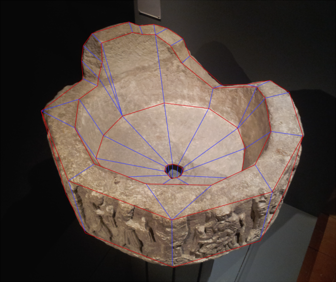
But model-wise, I should be able to make this without too great difficulty. As you can see on the edgeflow plans, most is pretty straight forward.

side

Edgeflow plans of the font.

Edgeflow plans of the font.

3D I – Crate Optimization

Urban Contemporary Crate – Optimized by Jonna Jarlson
The problems that this crate had was mainly that it still consisted of separate objects and that it wasn’t centered on the 0.0.0 coordinates.
This was rather easily fixed by Attaching the objects together, and simply specifying the coordinates of the object to 0.0.0.

While going through the xView filters Jonna also discovered a lot of overlapping surfaces. This was because the object is several forms combined into one, causing the inside faces of the boards to overlap with the “pillars” surfaces. This didn’t appear to be a problem however, as overlapping faces tend to become a problem first when it is two surfaces that are both facing the camera and occupy virtually the same space. This could cause texture clipping, as there could be confusion as to which texture would actually be shown.
This predicament could have been fixed by stitching the different parts of the object together, but as this would actually increase the combined geometry it was left as it was.

Four surfaces that could actually be fixed was the bottom of the “pillars”, as these would always face the bottom of the crate and never be visible to the camera. These faces was thus completely unnecessary and could be deleted.

The last thing she noticed was that there were a number of T-Vertices in the model. I am not entirely sure what this means, but I think it was explained as sharp angles that could be a problem animating since they could be misread by the engine. In something like a crate that doesn’t deform however it didn’t appear to be a very big problem. They could apparently be enhanced, I’m guessing by creating Tris instead of Quads?

Urban Contemporary Crate - Before and After

Urban Contemporary Crate – Before and After

Sci-Fi Crate – Optimized by Ida Lahti
The thing with this crate is that it didn’t really appear to have very many problems. The only things that I think were done was to delete the surfaces of the handlebars that are attached to the crate itself and then to Attach the handlebars to the crate, as they were separate forms in this object as well.
This actually surprised me a bit, I thought this would be the one of the three crates to have the most problems. I guess perhaps I’m a bit too careful when creating objects, only using geometry that is already sound instead of trying to create something that can later be fixed. Not necessarily a bad thing, but perhaps a bit stifling to one’s workflow.

Sci-Fi Crate - Before and After

Sci-Fi Crate – Before and After

Medieval Crate – Optimized by Me
This crate however, did have some problems. I had left some stray vertices on the bottom side of the crate, making a few n-gons that had to be corrected. This by simply taking the odd vertex and target welding it to another vertex nearby. I can’t quite figure out how those vertices got there though, as I can’t recall working on the bottom part in any greater extent.

The problems n-gons can cause is quite a bit as I understand it, as some engines can’t really process models with n-gons at all, so fixing these are pretty high on the to-do list when optimizing.

But other than that, this was also rather clean.

Medieval Crate - Before and After (selection shows area effected by n-gons)

Medieval Crate – Before and After (selection shows area effected by n-gons)

Here again I start questioning the shapes I use. It has stricken my on a couple of occasions that perhaps I am creating objects that are a bit simpler than I ought to. I am by no means particularly skilled in the art of 3D-modeling, but maybe I’m not really taking what I can do quite as far as I should. I tend to use extremely simple forms in creating objects, so being a bit more adventurous wouldn’t necessarily be a bad thing.