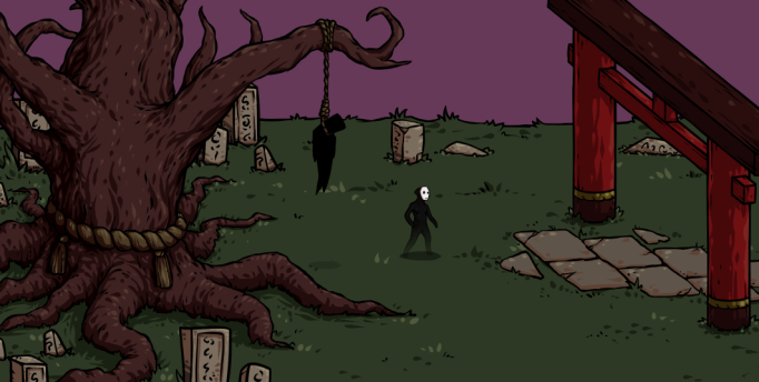
This week I actually have been able to work on something a little bit different than I have until now. Most of the animations are already finished and implemented, with the exception of the main character’s spawn animation (which is finished but still have to be implemented) and the potential boss’ animations (which is currently being made by the other graphical artists in the project).
This time I have been able to focus more on the graphics for the games foreground, creating trees, buildings and stones to make the world more interesting. These will mostly appear in the foreground just above the play area.
While creating them I tried my best to keep to our Asian theme, using roughly the same architecture and coloration for buildings and objects. Also to maintain the same look through all the graphics I went with pretty much the same process as when I created the animations (although making static objects is a bit faster and easier).
For the objects, unless it was something really simple, I started with a very rough sketch. This could be anything from a few odd lines for trees, just to establish a basic shape or bend, to more elaborate sketches for buildings, describing to a greater extent the structure and details.
Then I created the linearts, using the pressure-sensitivity of the tablet to great extent to make the variations in the lines thickness and make them a little bit more interesting than simple, even lines.
And finally, the coloration. Since part of our aesthetic goal is to attempt to make the player feel a slight sense of gloom as they play, we went with a relatively desaturated and dark color palette. So I started with laying down flats of the appropriate color for the objects, and then moving on to adding shadows over these, and finishing with highlights. The shadows I decided to pull towards a red tint, making it more coherent with our color palette, fuller than simply pulling it towards black and finally aiding in making it seem a little bit more unnatural.
Logically the shadows should have been more of a blue-ish tint of course, because of the Rayleigh scattering.
For the highlights I used lighter colors pulled a bit towards yellow, which tends to work very well in combination with red colorations. Perhaps because of how warm colors work in terms of color temperature.
There will most likely not be too many objects in the actual play-area since these would take additional time to implement because of hit-boxes, and also they may end up looking a little bit odd because of the perspective that we are using.
Anyway, hopefully putting all the objects together to a coherent level won’t be all too difficult. It has worked quite well in the attempt below at least.
